
In the world of visual communication, I see the poster as the ultimate discipline. Having worked as a Graphic Designer and Creative Director, I have been involved in numerous film posters (recently for the MUBI release of the Palme d’Or winning Titane). I believe that, despite its technological redundancy in the social media age, there’s no other medium that challenges a designer in quite the same way. A poster needs to convey a message succinctly, catching the attention of a passerby against a backdrop of competing visual noise, all within the boundaries of a printed rectangle. They tend to convey a sense of urgency, projecting a film’s message without giving too much away. One of the most important design elements of political film posters is the use of typography, making the film’s title prominent. It becomes legible from a distance, but also strikes the right emotional tone: The opening scene of the poster, if you will.
In Spike Lee’s 1992 classic Malcolm X, he depicts the life and impact of the eponymous radical African-American activist. The Malcolm X poster was designed by Art Sims, and was the designer’s first typographic campaign after a series of image-led projects. Sims chose the most impactful contrast, setting a white ‘X’ against a solid black background. This design marked a departure from tropes of 90s Hollywood film posters (Sleeping with the Enemy, Top Gun, and Basic Instinct all feature the star with imagery that represents the events in the movie). Brutally simple, the X stretches across the poster, anchoring each line with fat slab-serifs on four corners. It is only supported by the release date placed at the bottom in a significantly smaller size. I was fascinated by this design, and after some digging, I discovered a YouTube video documenting a conversation at an exhibition of Sims’ work at the University of Michigan. Sims recalls asking Denzel Washington, the movie’s star, “Do we do the young Malcolm…the old Malcolm…the angry Malcolm…or the Malcolm before he passed away?” Washington responds: “Look, man, he’s so complicated. I don’t know…Let’s just do the X!” This brief discussion laid the foundation for one of the most impactful and iconic film posters of the nineties.
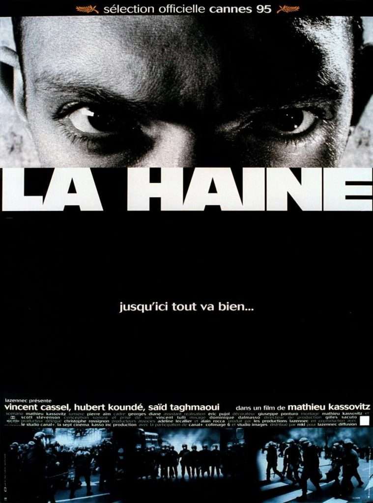
Another key design element of political film posters is the use of photographic imagery. La Haine (1995) is a distressing excursion into the life of Parisian suburbs, where young people face a hopeless future. Director Mathieu Kassovitz takes his audience on a thrilling black-and-white journey, portraying three young men from immigrant families in the aftermath of a riot, triggered by an act of brutal police violence. Faced with the task to promote an intense and politically charged film, the (unfortunately uncredited) designer opted for something restrained but powerfully graphic. They used a tightly cropped photo of actor Vincent Cassel (Hubert Koundé and Saïd Taghmaoui appear in variations of the poster), aggressively staring at the viewer beside a tightly set, heavy cut of a sans-serif typeface. The film’s title stretches across the full width of the poster. At the bottom, we find a collage of images showing police in riot gear. The choice of the images, and how they’re edited, reverse the prevailing power structure: a strong immigrant fiercely looks down on morally questionable police. The images are divided by a quote from the beginning of the film: “This is the story of a man who falls from a fifty-story building. The guy, as he falls, keeps telling himself: ‘jusqu’ici tout va bien’—‘so far so good, so far so good, so far so good.’ But the important thing is not the fall, it’s the landing.” The reversed juxtaposition of protagonist and antagonist captures the film’s essence to powerful ends: Hate is a vicious circle: ‘La haine attire la haine!’—hatred breeds hatred.
Another great example is for Robert Altman’s Three Women. Polish graphic designer Mieczysław Wasilewski decided against photography and instead opted for a bespoke illustration in his signature style. The 1977 film depicts the increasingly bizarre, mysterious relationship between a woman and her roommate and colleague in a dusty California desert town. It touches on themes of identity, obsession, schizophrenia, and personality disorder, digging deep into the psychology of dreams. Using obvious metaphors, Wasilewski captures the idiosyncratic film in an inventive image of a spoon, knife, and fork, rendered as sharp silhouettes. By adding facial features to each piece of cutlery he artfully hints at the three main characters and lifts the image from the mundane into an eerie dreamscape. Evoking at the same time a sense of fascination and strangeness, Wasilewski has created an image that, just like Altman’s film, transcends its metaphoric structure and could stand up as an independent piece of graphic art.
Poster design has had an understated impact on the films they promote. Designers create artwork that not only helps achieve the film’s commercial goals, and capture the attention of audiences, but also promote the ideas of filmmakers beyond the big screen, and into society through a single, sometimes iconic, poster.


