
Amid the billboards and brand slogans of 1960s California, a generation of female artists remade commercial language into a radical visual symphony of faith, protest and self-determination, writes Rosalind Jana.
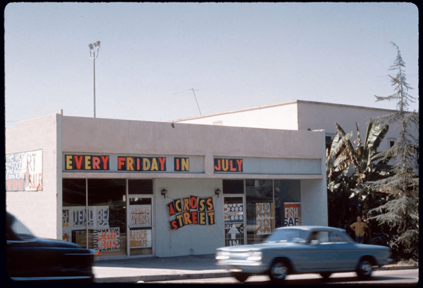
Drive down the 101 and the eye is assailed from all directions. The roadside is an ever-unfolding ribbon of text: billboards sliding past, storefronts painted in block capitals large enough to be read at speed. Most of it is asking for something. It wants your money, your attention, your loyalty, your vote. Even the invitation to attend church is framed as a proposition. In California, language accumulates, fades, is painted over and repainted so that the ghostly outlines of old promises hover beneath fresher ones. The state has long sold itself as a place of renewal, and that promise has always been written large.
By the 1960s and 1970s this landscape of persuasion was inseparable from political life. The Vietnam War entered American homes each evening through television screens; photographs from Selma circulated widely in newspapers and magazines; in Los Angeles, the Watts uprising of 1965 marked a rupture in the city’s racial politics and cultural institutions. Within the Catholic Church, Vatican II reconfigured liturgy and authority. Civil rights and Black liberation movements gathered force, anti-war protests generated posters and 236 underground newspapers, and feminist organising—from consciousness-raising groups to newly established art programmes such as the Woman’s Building in Los Angeles, co-founded in 1973 by artists and designers including Sheila Levrant de Bretteville—insisted on different forms of authorship and representation.
The images these movements drew on were not singular but repeatable, capable of being printed again and again, shifting scale without losing force. In the Bay Area, artists such as Betty Nobue Kano worked within Asian American activist networks where printed matter and posters functioned less as gallery objects than as tools for community use.
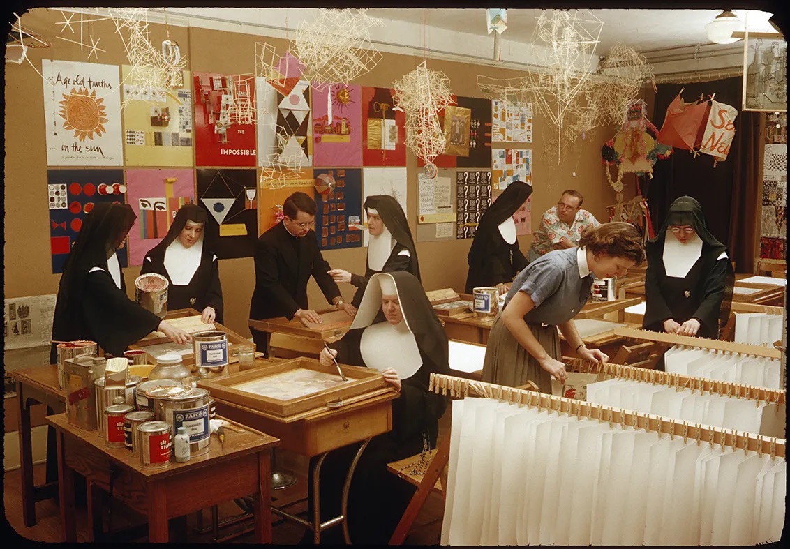
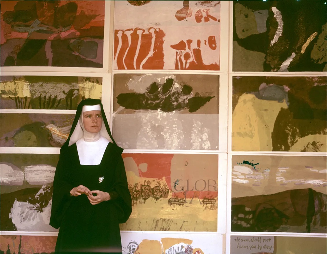
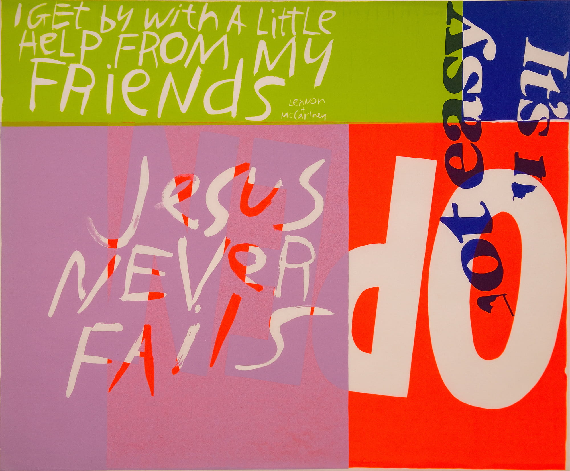
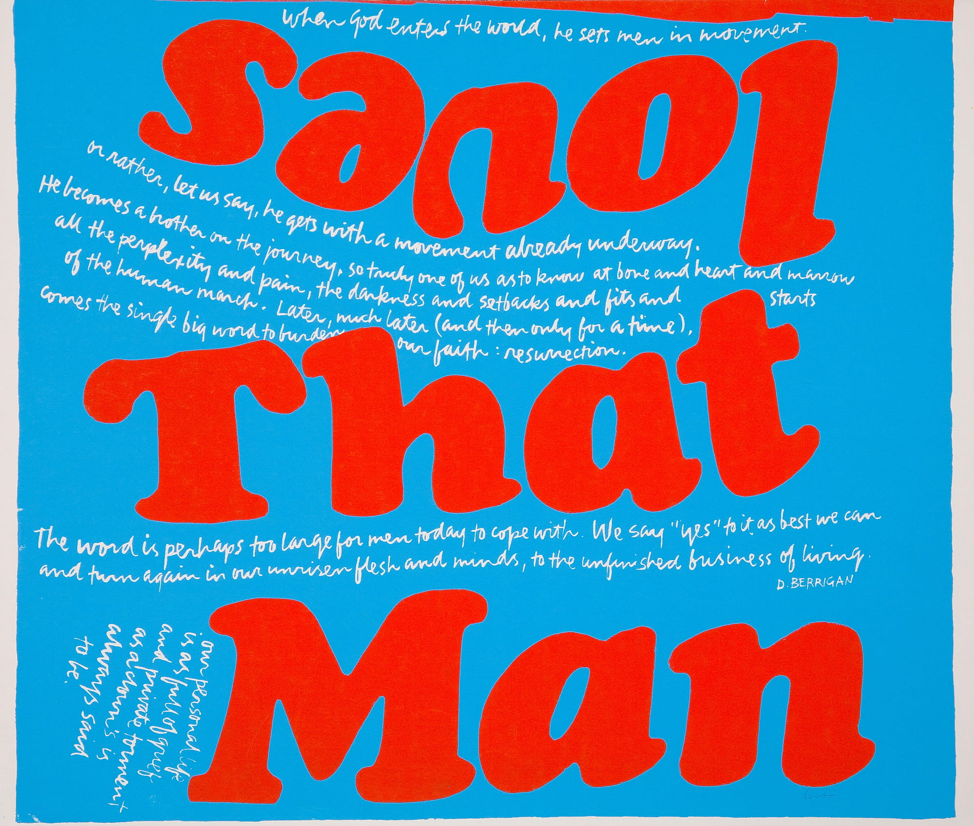
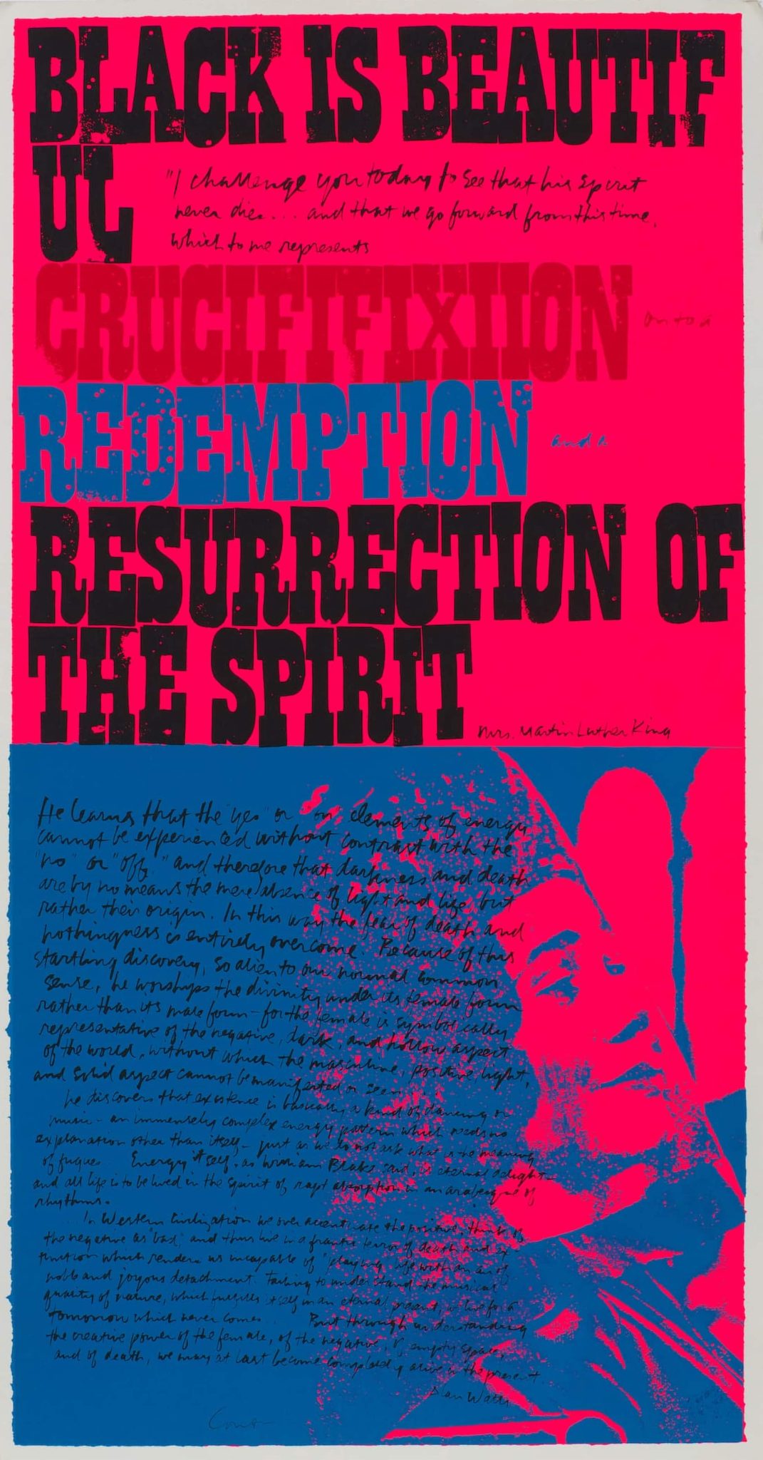
Frances Elizabeth Kent, known as Sister Corita, had entered the Immaculate Heart of Mary order in the 1930s and later headed the art department at Immaculate Heart College in Los Angeles. By the early 1960s she was teaching young women to look at the commercial world around them as raw material. Supermarket packaging and advertising copy were brought into the studio and examined as closely as canonical paintings. A list titled “Ten Rules for Students and Teachers” was pinned to the wall, among them: “Nothing is a mistake. There’s no win and no fail, there’s only make.” Her classes moved between scripture, pop lyrics and product slogans without treating them as separate registers. At the same time, she was producing her own screenprints in bright, declarative colour, layering biblical text with fragments of advertising language and setting them in bold commercial type.
In The Juiciest Tomato of All (1964), Kent adopted the format of a Del Monte label and printed the word “TOMATO” prominently across the surface, followed by a text that moves between supermarket rhetoric and devotional reflection. “It is not desecration to add: ‘Mary Mother is the juiciest tomato of them all,’” it reads. The work continues by invoking cigarette advertising—“So round, so firm, so fully packed”—and describing the ways in which such slogans stir desire. Cardinal James McIntyre, Archbishop of Los Angeles, objected to the direction taken by the Immaculate Heart sisters and to Kent’s art in particular; he later described Christmas cards produced by the order’s art department as “an affront” and “a scandal.”
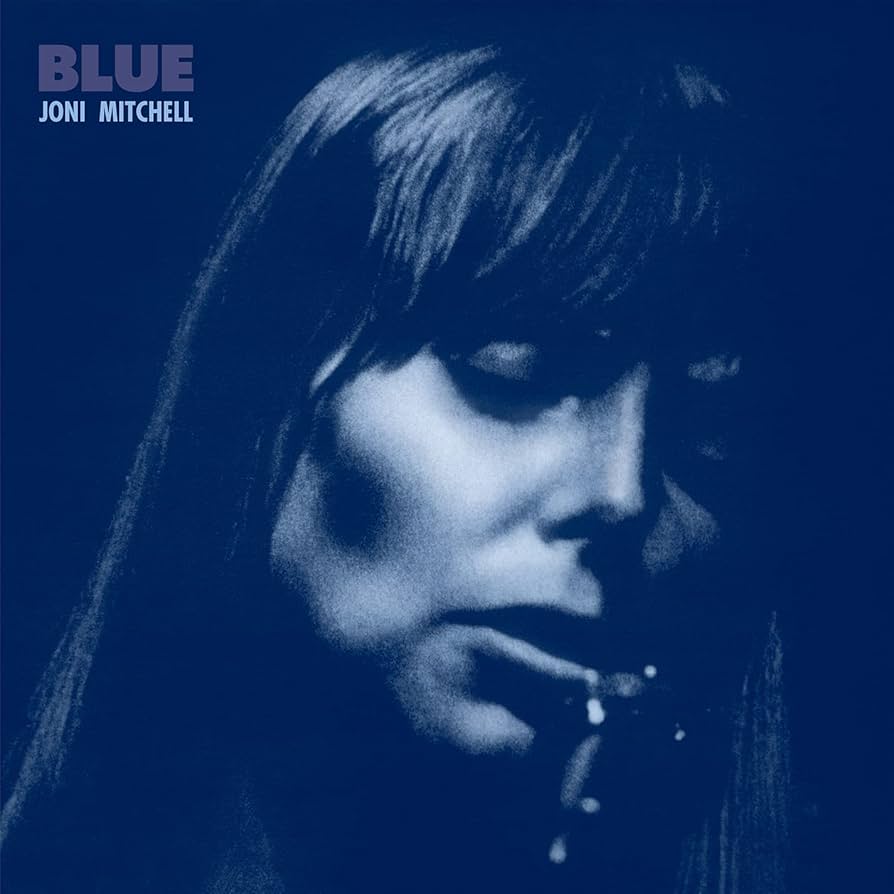
The resistance to prescribed form was not confined to the Church. When Stewart Brand interviewed Joni Mitchell in 1976 about her schooling for a proposed benefit debate supporting Immaculate Heart, she described a childhood shaped by correction. In art classes she had been encouraged to copy magazine covers rather than develop her own imagery. She was reprimanded for playing piano by ear and failed twelfth grade after years of cramming, only to excel technically at art college and grow disillusioned there as well. The training she received taught her how to execute; it did not tell her what to say. She later described herself as self-educated, having had to undo aspects of that instruction to arrive at her own visual language.
The cover of her 1971 album Blue, which Mitchell designed herself, presents a close-cropped, blue-toned photograph of her face, partially shadowed, with the title and her name set plainly across it. At a moment when album sleeves were often crowded with illustration and colour, this one limited itself to a single portrait and spare lettering. Mitchell controlled not only the songs but the surface that carried them into shops and homes.
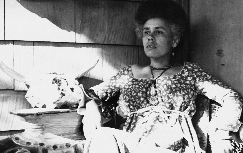
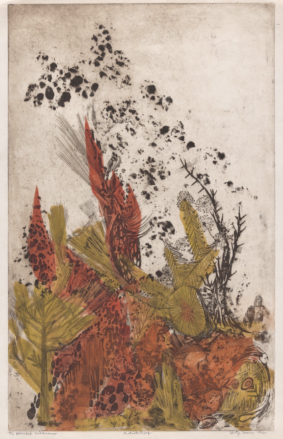
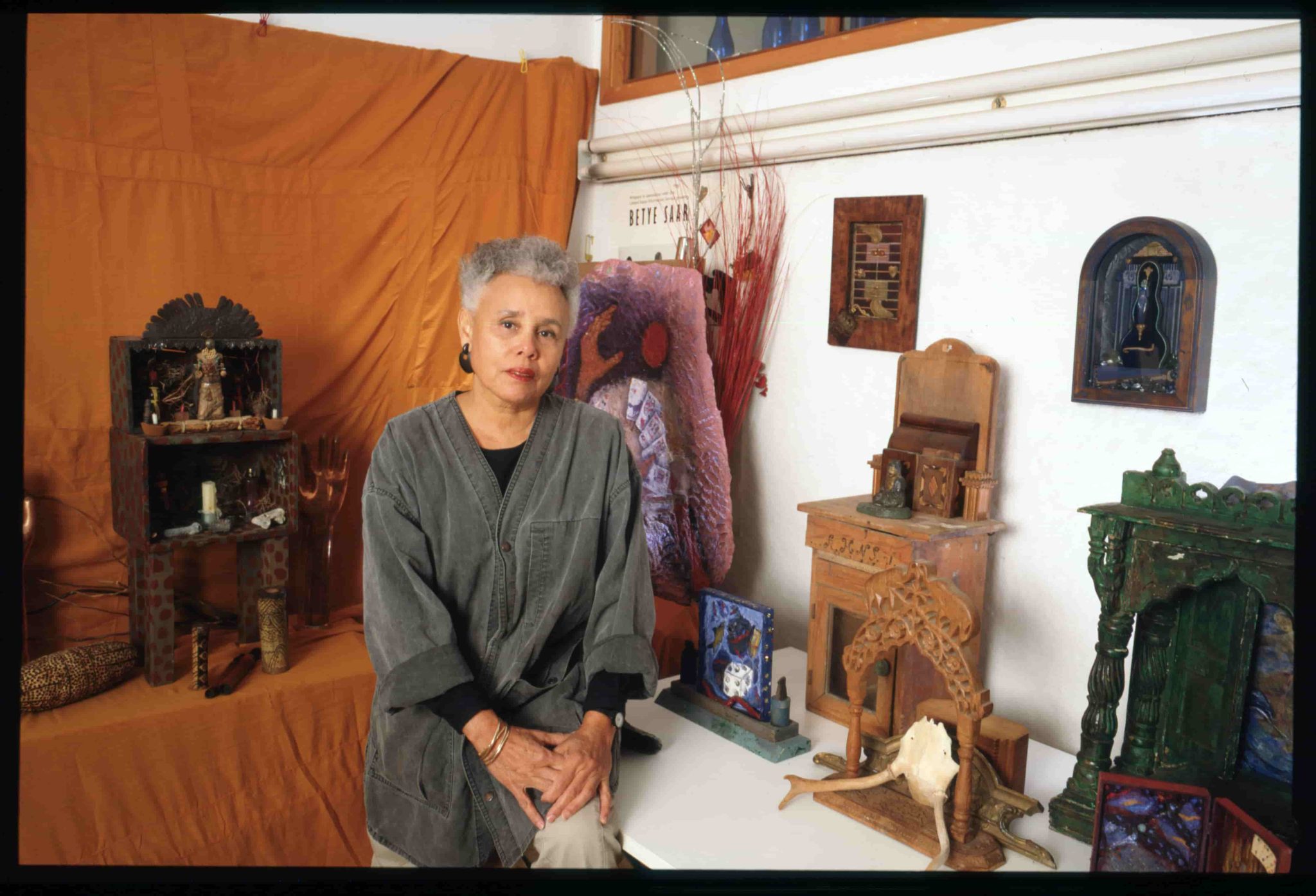
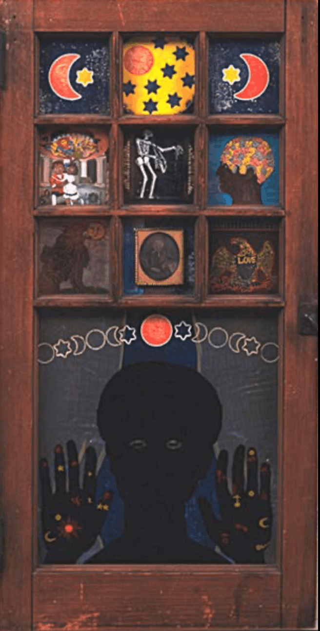
Questions of surface and authority also shaped Betye Saar’s work. After studying design at UCLA, Saar trained in printmaking, working in etching and serigraphy. In 1967 she encountered a Joseph Cornell exhibition at the Pasadena Museum; the small boxes, assembled from postcards, trinkets and scraps, demonstrated how objects already in circulation could be rearranged into new configurations. Saar began collecting figurines, product labels and printed ephemera. Following the assassination of Martin Luther King Jr. in 1968, her attention turned more explicitly toward racial politics.
In 1972, invited to contribute to an exhibition about Black heroes at the Rainbow Sign community centre in Berkeley, she decided to make what she called “a black heroine.” For years she had gathered derogatory advertising imagery: postcards, product labels, caricatured figurines. In The Liberation of Aunt Jemima she placed a rifle in the figure’s hand and set her before a postcard depicting another stereotype of Black womanhood, leaving the familiar grin and headscarf intact. Reflecting on Saar’s work in 2018, the curator Wendy Nālani E. Ikemoto observed that it is “as if Saar is suggesting how racism is so entrenched in our nation that it has become a national brand.”
Ruth G Waddy approached the question of graphic authority from yet another direction. Born in Minnesota in 1909, she studied design briefly at UCLA before leaving school during the Depression. In Chicago she worked as a domestic servant and met the poet and artist Margaret Burroughs, who introduced her to printmaking. During the Second World War she moved to Los Angeles, working as a riveter and later as a clerk. In the early 1960s, after being diagnosed with epilepsy and leaving paid employment, she began contacting African American artists in Los Angeles with the intention of organising an exhibition. The exhibition did not take place, but the network that formed became Art West Associated.
Waddy insisted that Art West exhibitions be juried by outside figures, including Samella Lewis and William Pajaud, because she did not want “politics or favourites” to determine selection. In 1965 she travelled by bus across several states to assemble what became Prints by American Negro Artists, mapping her route according to where artists lived and asking if they or their relatives could offer her a place to stay. Letters requesting prints often went unanswered. “They didn’t come to me,” she said. “I went and got them.
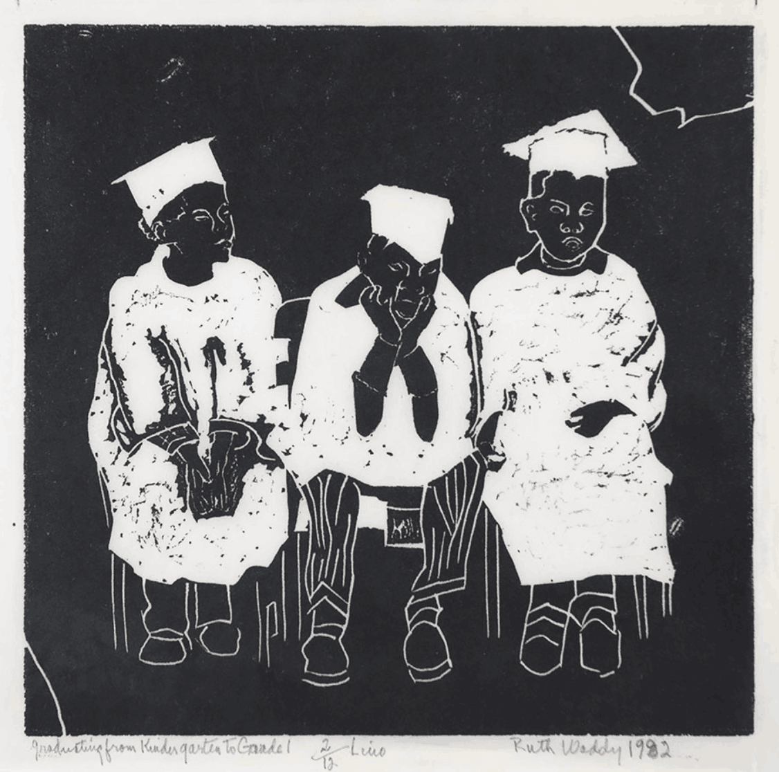
Printmaking appealed to her not only aesthetically but practically. Prints were less expensive to frame and easier to ship; they could be produced in editions of 20 or 25 and distributed beyond a single gallery wall. Waddy selected works according to what she liked best, even after reading instructional literature on portfolio building, always driven by her own singular taste. When artists pressed her on technical questions, she enrolled in classes so she could better understand and answer them. In 1969 and 1971 she co-edited, with Samella Lewis, the two-volume Black Artists on Art, compiling essays, interviews and reproductions of contemporary African American artists and creating a record where none had been consolidated. Her own print A Matter of Opinion reduces argument to columns of varying heights, standing in for positions formed on misinformation or prejudice rather than fact.
“Art is work,” she said, and for her that work included organising, editing and travelling by bus. Waddy’s routes traced a different map across the country as she carried portfolios from city to city and persuaded artists to contribute their work. Like many of her contemporaries, the prints she gathered were small enough to stack, to mail, to circulate beyond a single wall.