

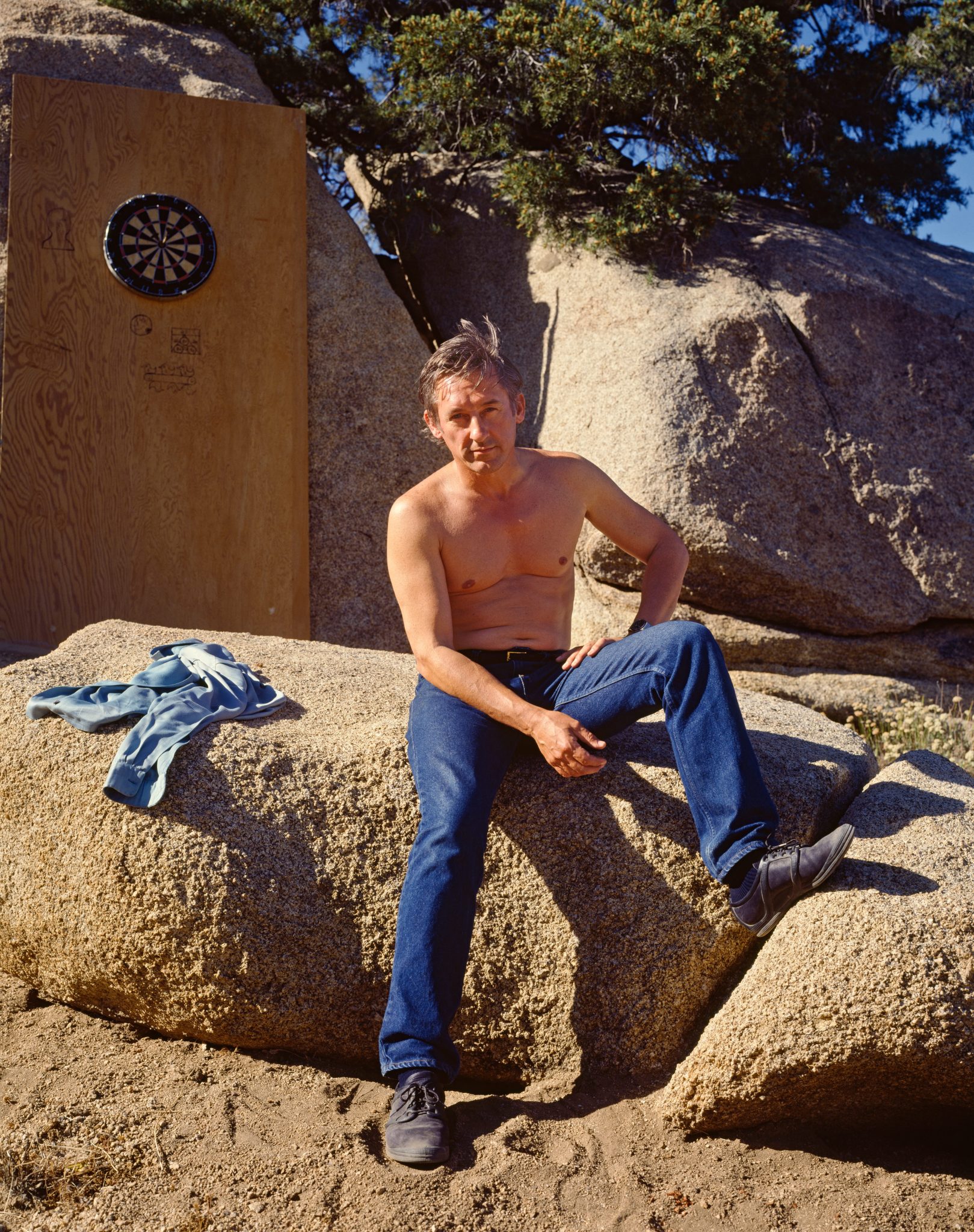
Ed Ruscha is the defining artist of California cool—with a career spanning over half a century and across multiple mediums, from photography to screen printing. Art historian Matthew Holman pens an essay to Ruscha’s vision, preceding a series of witty Q&As conducted in Los Angeles.
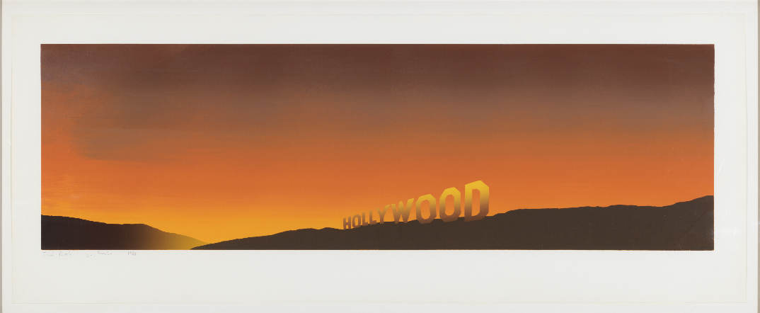
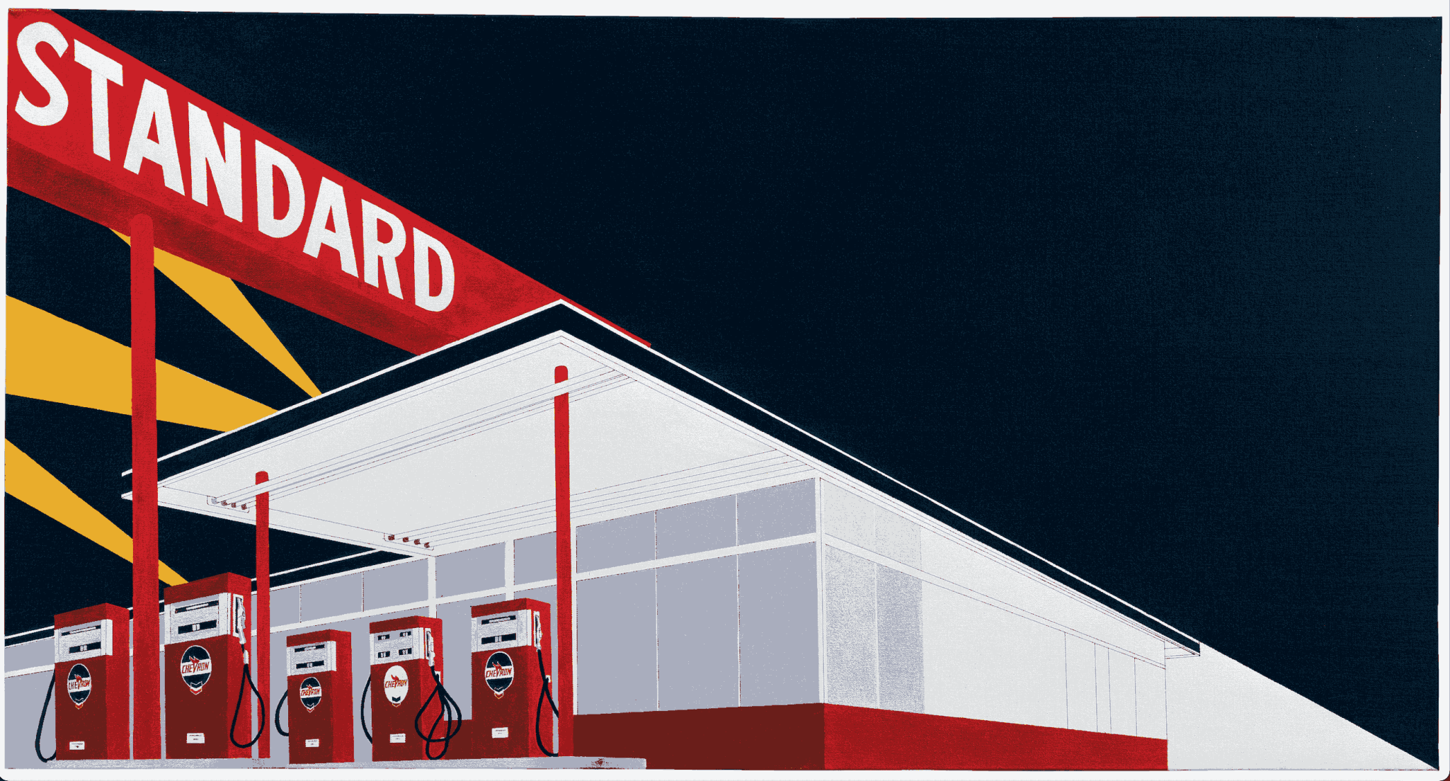
“There’s something new-world about this place that is untapped,” Ed Ruscha once said of Los Angeles, filmed from the passenger seat of his car. “It is still here to be utilised.” As the artist cruises along the Sunset Strip, a stone’s throw from the Hollywood sign on Mount Lee, past a billboard advertising a performance by the singer Sylvie Vartan (“The Best Gift from France Since the Statue of Liberty”) at the MGM Grand in Las Vegas, and finally pulls into a Chevron Standard station for gas, you see what he means. Everything becomes material, ready to be tapped through a supersized straw. Ruscha has been mining Los Angeles for more than six decades and for him the city appears as a continuous field of usable images. Everything is potential subject matter, waiting to be absorbed and reworked. His 1966 screen print Standard Station, one of the most recognisable works in the Museum of Modern Art’s collection, is celebrated for its flowing colour gradients produced with the “split fountain” technique—a commercial printing method he learned as a young sign painter and illustrator, while lettering gift items during Christmas rushes. The result is both distinctly his and uncannily familiar: the image resembles the gleaming surface of a Sunset Boulevard billboard, its vinyl sheen hovering somewhere between advertisement and painting. Later, he figured a series with a Standard station engulfed with flames.
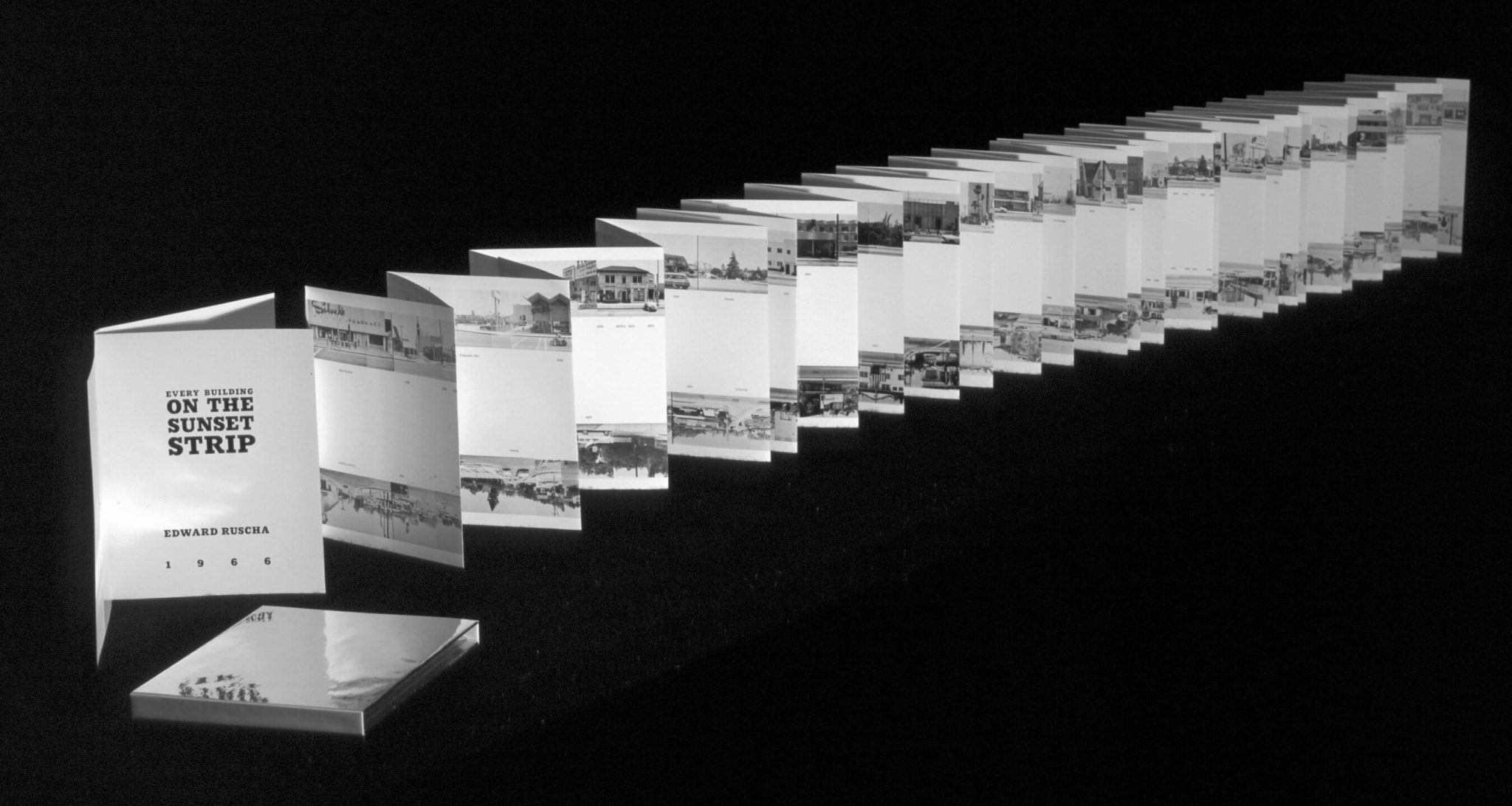
For Ruscha, Los Angeles was always a little surreal, and felt like a kind of “science fiction… the thing that got me out here.” He contrasted it with New York—then the art world’s centre of gravity—which he dismissed as “cold and intellectual”, a city with “no more room”. California continued the promise of his native Oklahoma: like the Okies of the Depression era, one could simply follow Route 66 westward. You might even find gold. Space seemed unlimited, and his subjects came directly from the everyday landscape—sidewalks, parking lots, steel supports, and low commercial facades. In 1966, the same year he produced Standard Station, Ruscha mounted a motorised camera on the bed of his pickup truck and, with friends, made a 25-foot accordion-fold book—a continuous photocollage recording both sides of a mile-and-a-half stretch of Sunset. To him it resembled a Western film set, where “a storefront plane… is just paper, and everything behind it is nothing.” Looking at a Ruscha painting produces a similar sensation. The surface appears flat and immediate, yet it hints at an indefinite depth, as if the city might continue forever just beyond the frame.
– Matthew Holman
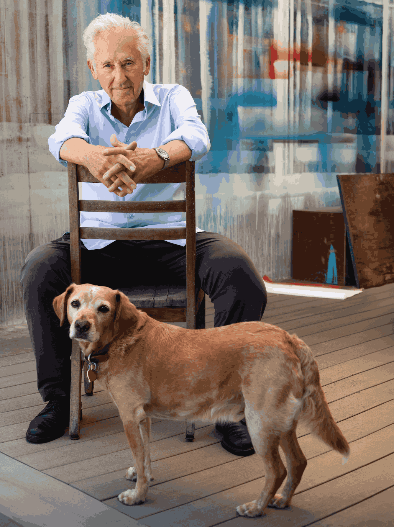
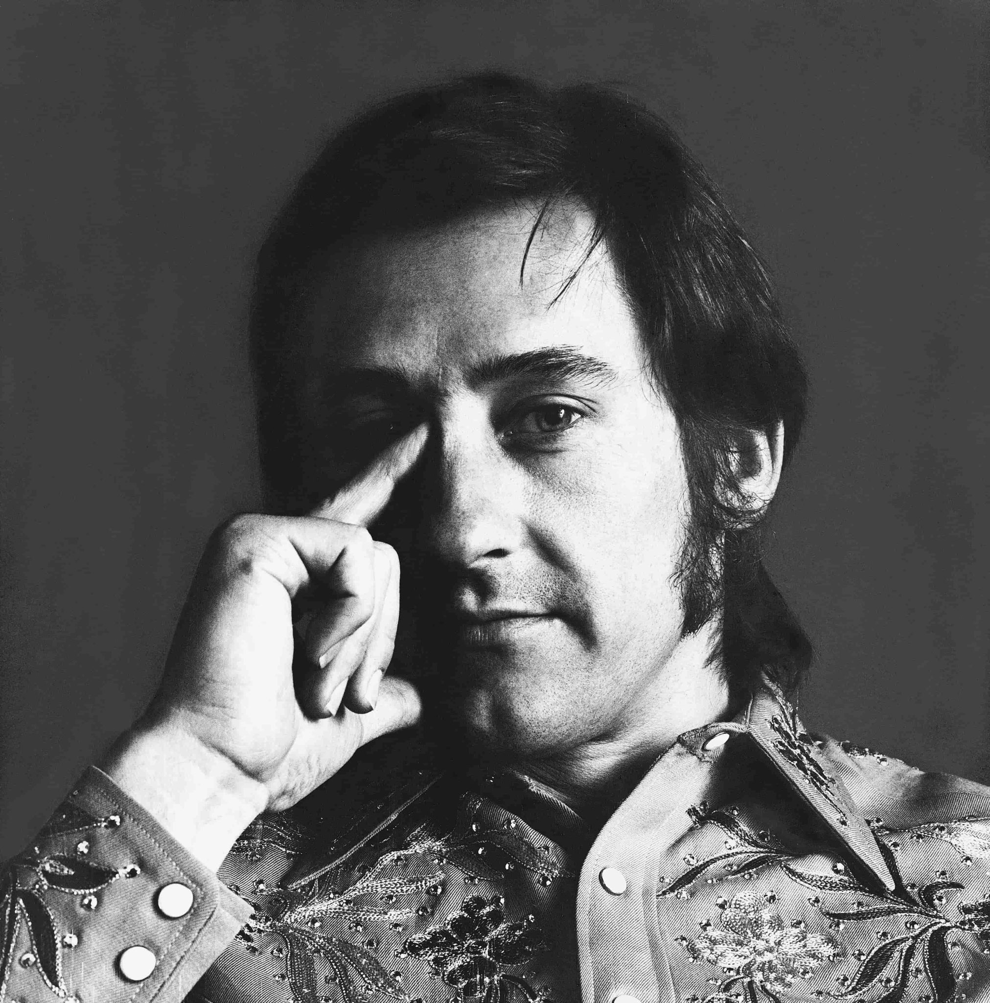
Ed Ruscha. By Greg Gorman.
The following is a series of questions between Ed Ruscha and our deputy editor Chris Cotonou:
What did California give you early on as an artist that you didn’t realise you were being given at the time?
It gave me the very beautifully named Sunset Boulevard, and I have played with that street for a long, long time.
It’s been 60 years since Every Building on the Sunset Strip (1966). Your early books feel like cinematic tracking shots. Were you consciously thinking about film, or was it simply how the Strip revealed itself?
I like to think that one day history flung out Sunset Boulevard like a roll of toilet paper, and let it settle by itself. Maybe history said, “You’re on your own” and left it at that.
What do the streets you documented 50 years after that project symbolise to you?
We’ve had cameras for ages. My regret is that we didn’t record the streets of Los Angeles way, way back. Wouldn’t that have been sensational?
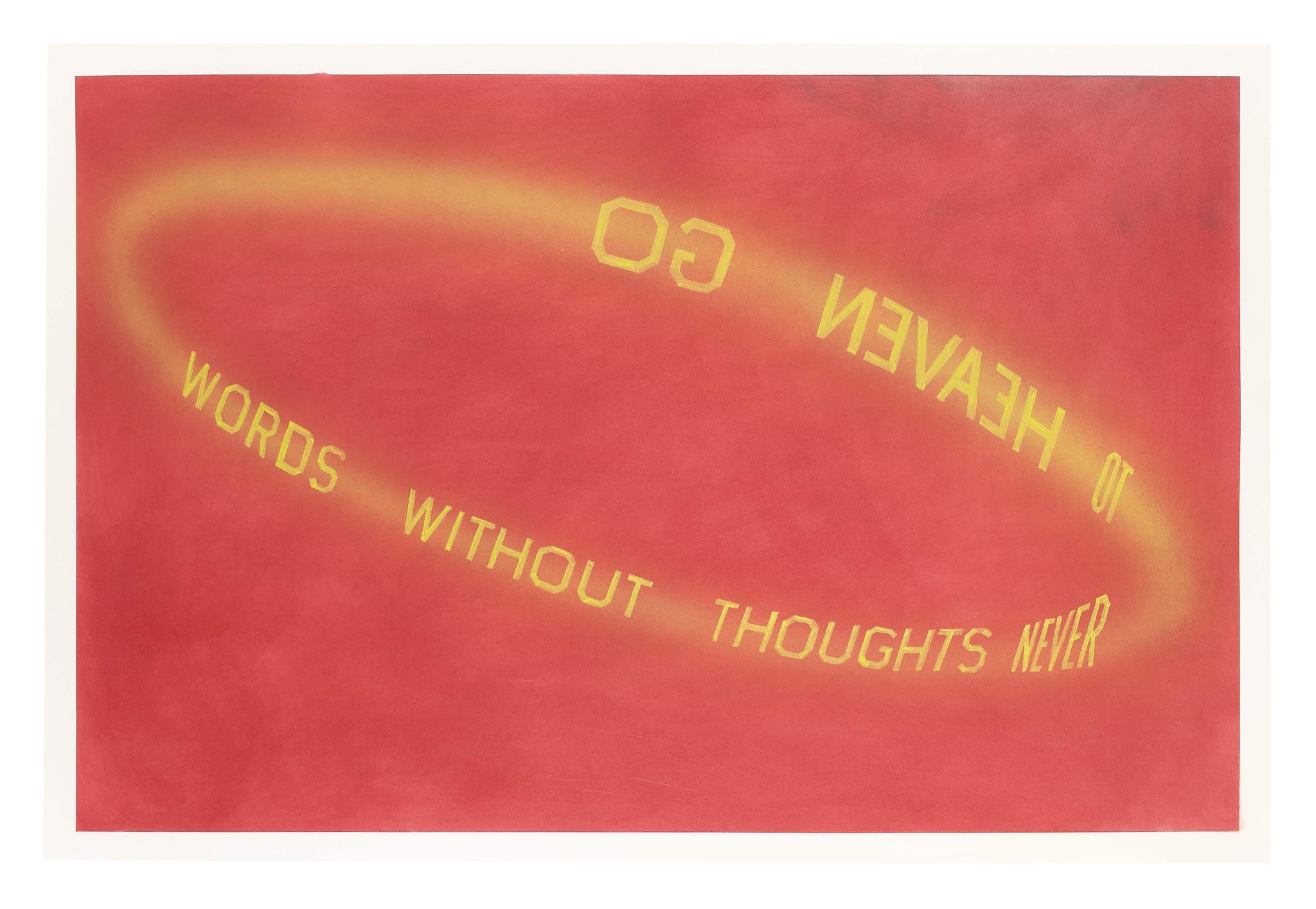
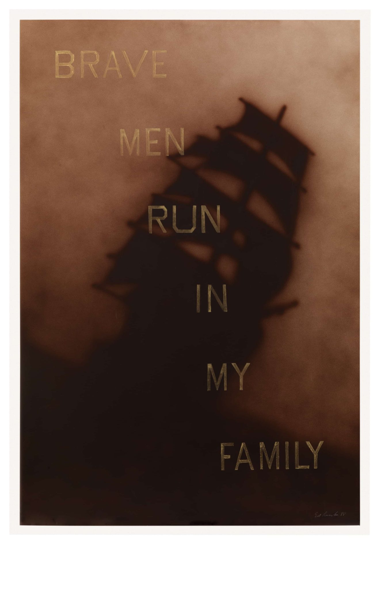
Your work often treats words as images rather than carriers of meaning. Do you feel language has become more or less visual in the age of screens?
Sometimes art is half gibberish. Over the years I’ve regretted not paying more attention to the gibberish in art. I could have invented words that didn’t mean anything. Wow! Where did I go wrong?
Do you recognise today’s Los Angeles in your earlier works, or do they now feel like documents of a vanished landscape?
As temporary as things are in this city, an overall story gets passed along. If only we’d learn from it.
What continues to pull you back into the studio each day?
It’s a gravitational pull that I can’t explain. It offers daily ammunition. It’s the kind of circus I really go for.
You have donated work to environmental causes. Do you see it as the artist’s responsibility to raise awareness on issues like this, especially considering the fires in California last year?
Good causes need attention, so donating to these entities enlivens the whole picture and rolls us forward. Goodness can beat out badness, if you help it along.
What advice would you share to an artist today?
Don’t give up on the picture frame. Don’t let it get lonely.


Footnote
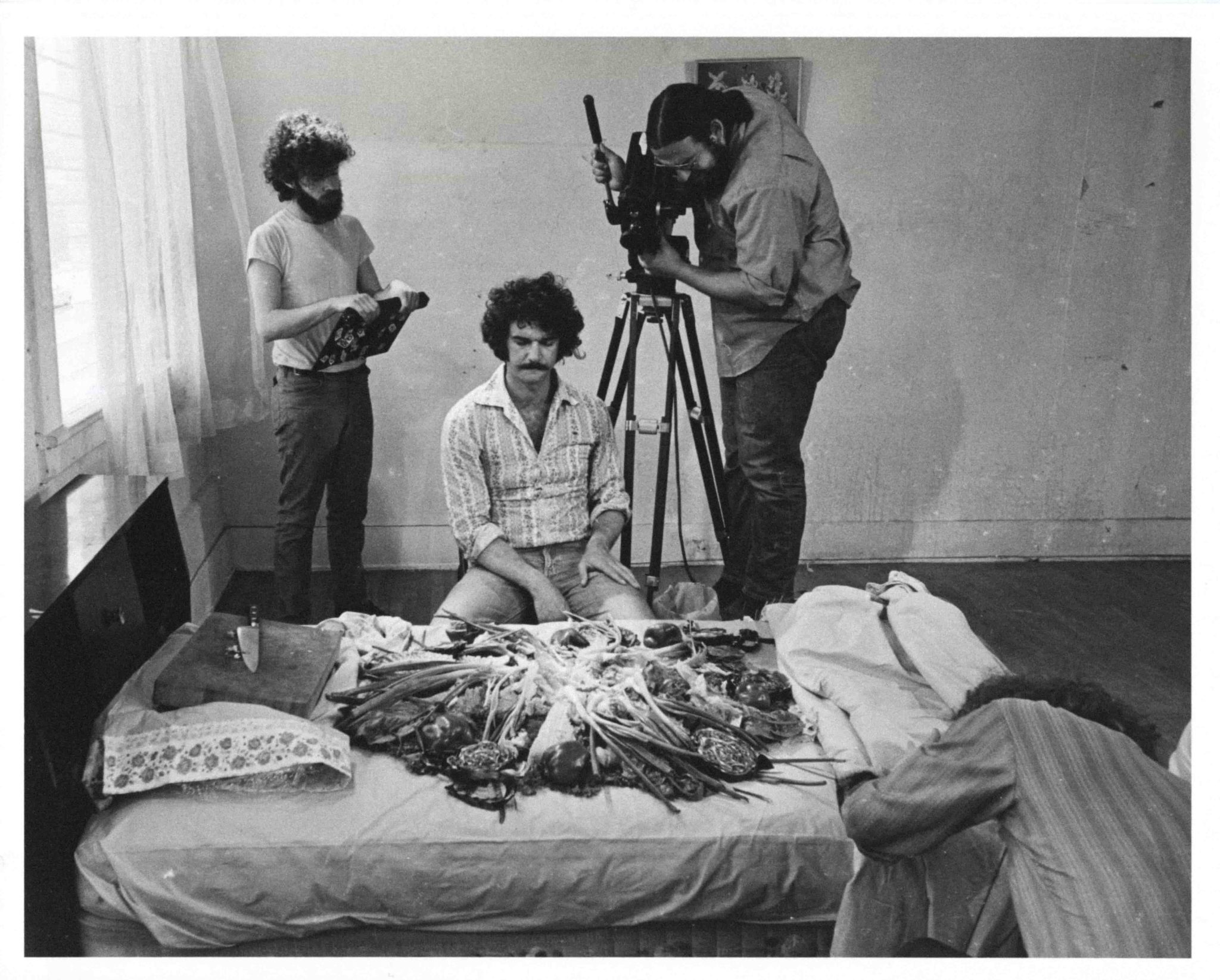
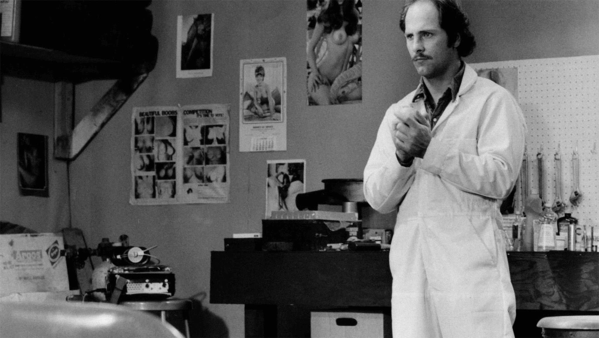
Ruscha’s engagement with film, notably through his direction of two short films, Miracle (1975) and Premium (1971), is an extension of his critique of consumerism. It is a theme pivotal to his Pop Art significance. These short films, both rich in colour and narrative, transform mundane, everyday consumer experiences into subjects of artistic exploration. They’re worth discovering to see how Ruscha depicts the commercialised American landscape through a variety of mediums.